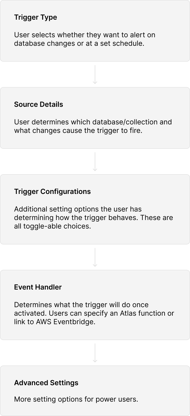
MongoDB Triggers Configuration Revamp
MongoDB triggers allow users to execute functions in response to database changes or at set time intervals. Triggers are a commonly used tool among MongoDB customers, and their popularity can be attributed to the wide range of use cases they can accommodate. Given this, the initial configuration of triggers must be intuitive and straightforward; however, this was not the case.

Based on research provided by the product team, users struggled with various aspects of the existing configuration form design, such as the inability to locate desired features due to poor information hierarchy. To address these issues, I revamped the existing triggers configuration form.

The designs shown here were implemented in June 2024.
Improved triggers configuration form
Current Experience
Creating Separation
The original format of the form was one long continuous scroll. There was poor separation between different configuration sections, and new users could easily become overwhelmed with the long list of configuration options. My first step in approaching the redesign was to create clear separation between sections so users would not be overwhelmed.
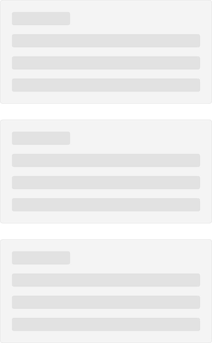
Breaking each section into collapsible cards provides much better separation within the form
Form Ordering
Apart from visually breaking apart the form into digestible pieces, the ordering of input fields themselves needed reorganization to match users' mental flow when creating a trigger. Additionally, certain features that were hidden due to their placement in the form needed to be exposed. Take 'Auto-Resume', an option that, despite being available for years, still receives feature support requests from users. After brainstorming with the engineers, I mapped out a logical trigger creation flow that would serve as the skeleton of the form.
New Form Design
Improving the Edit Flow
The edit flow for an existing trigger opens up the initial long form experience when creating a trigger, and I wanted to take advantage of the revamp to improve the editing experience. Users who are editing a trigger would most likely be trying to hone in on a specific configuration they wanted to change, and having the long form would slow them down as they needed to scroll and sort through the form to find the right place to make their desired change. Instead, I proposed a collapsed view with the configuration settings of each section highlighted with badges, allowing users to quickly parse the information and decide where they needed to go to make their change.
Empty State
I also took this opportunity to do a visual refresh of the empty state of the triggers home page.
Old empty state
Updated empty state
User Testing
7/8 users felt the new form was more intuitive than the old one.
"It’s grouped differently compared to the old form, and I find the new grouping more clear to navigate, the old form felt a bit clunky compared to this one."

- User's First Impression of the New Form
6/8 users preferred the new edit flow over the old one.
"I like that you can get an idea of what is happening with the trigger at a quick glance. This new version [edit flow] feels more like an actual editing flow."

- User Feedback on the New Edit Flow